Midas Rewards
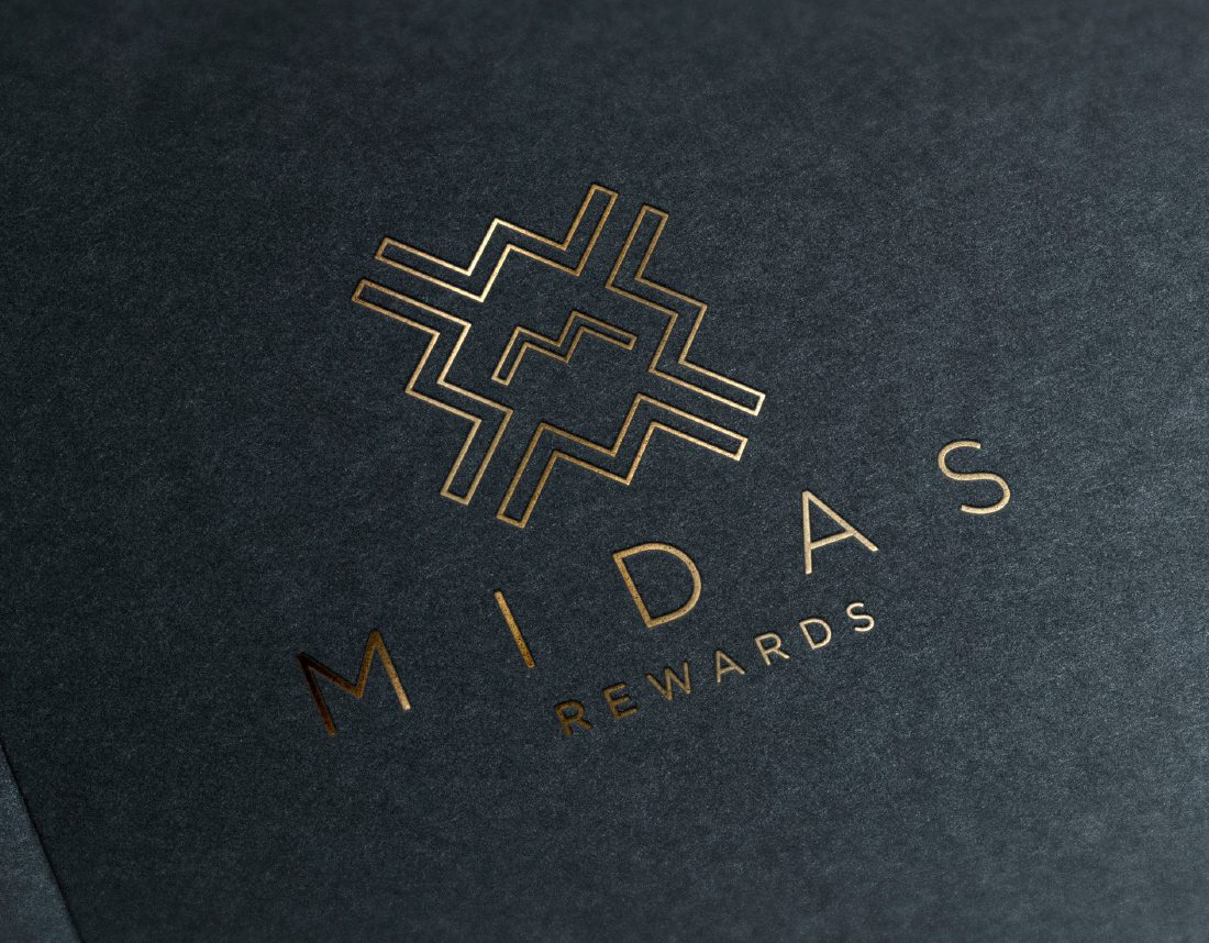
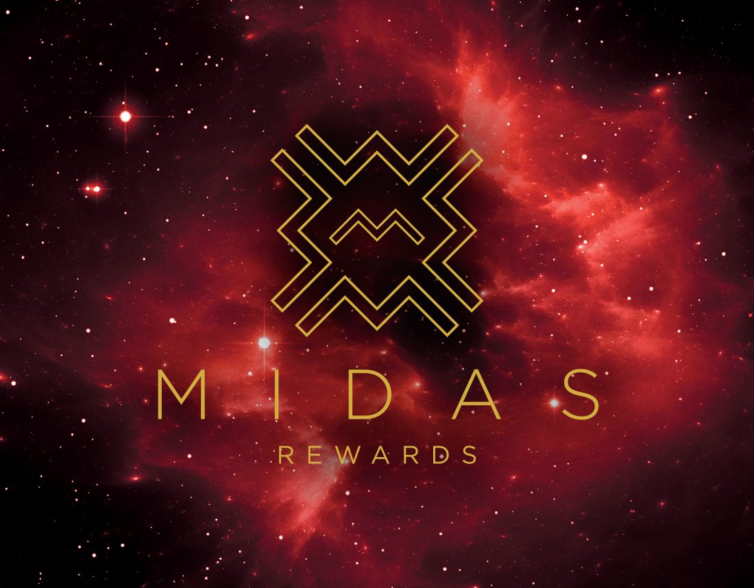
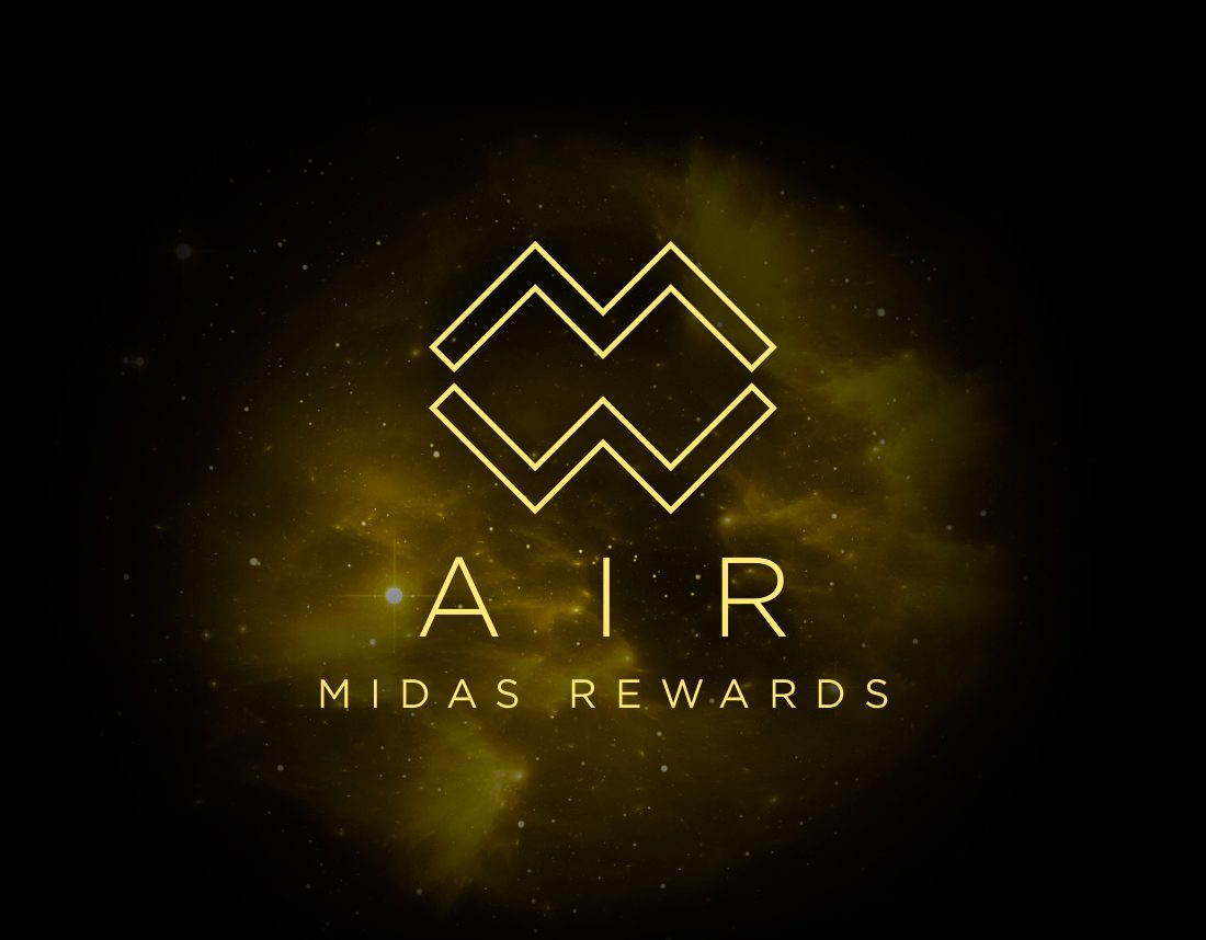
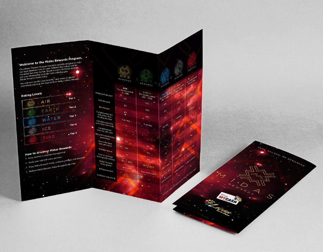
Lions Richlands wished to refresh their members rewards program — the expectation was simply an evolved logo suite. Instead we explored a new, sophisticated logo direction that could stay current through changing times. Built on the letter M (Midas) — each tier element was constructed from 2 x M’s to create the capital letter for that tier. The main logo is a unity of all the earth’s elements. After deliberation, the clubs management acknowledged this over and above approach by our team to be exactly what the venue was looking for. Fresh and original, the program continues to enjoy success today.
CLIENT
Category
Branding, Brochures
